You’ve seen them. Those high-definition, glossy pictures of the crown jewels that pop up every time there’s a coronation or a royal funeral. They look heavy. They look sparkly. But honestly? Looking at a 2D image of the Imperial State Crown is a bit like looking at a photo of the Grand Canyon—you get the idea, but you’re missing the sheer, visceral weight of the thing.
There is a weird tension between the public’s obsession with these objects and the extreme security that keeps us from ever getting too close. We rely on official photography because, let’s be real, you aren't getting your phone out in the Jewel House at the Tower of London. The Warders are polite, but they aren't that polite.
The Photography Problem: Why Diamonds Look Flat
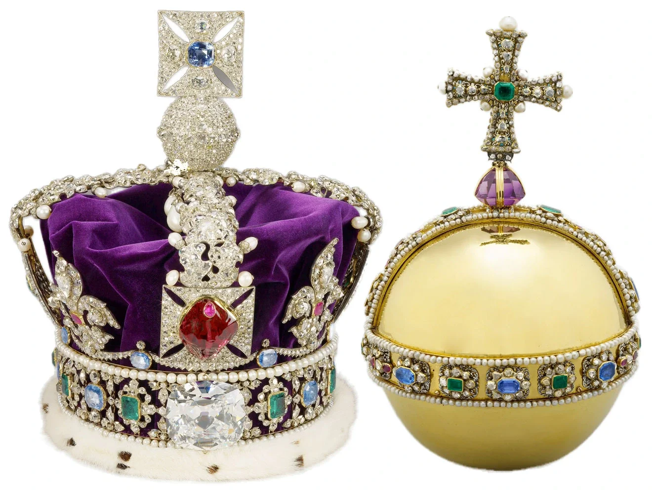
Capturing pictures of the crown jewels is a technical nightmare. Think about it. You’re dealing with the Cullinan II diamond, a 317-carat monster. Diamonds are literally designed to bounce light in every direction. When a photographer tries to snap a still image, the "fire"—that rainbow flash you see when the stone moves—usually disappears. It just turns into a white glare or a dull grey spot.
Most of the "official" shots we see were taken under incredibly controlled conditions. We’re talking about light boxes, specialized macro lenses, and probably a few nervous security guards breathing down the photographer’s neck. Even then, a photo can’t capture the way the Black Prince’s Ruby actually looks like a congealed drop of blood when the light hits it from the side. It’s a spinel, by the way, not a ruby, but "The Black Prince's Large Red Spinel" doesn't have the same ring to it.
History isn't just in the books; it’s sitting in those velvet-lined frames. When you look at a close-up of the Sovereign’s Sceptre with Cross, you’re looking at the Cullinan I. It’s the largest colorless cut diamond in the world. 530 carats. In pictures, it looks like a glass paperweight. In person, it feels like it has its own gravity.
The Evolution of How We See the Regalia
Back in the day, if you wanted to see the jewels, you had to be "someone." Or you had to pay a small fee to a very shady 17th-century caretaker who might let you peek through some iron bars. It wasn't until the mid-20th century that high-quality color photography really democratized these objects.
Before that, we had engravings.
Imagine trying to understand the complexity of St. Edward’s Crown—the one actually used for the crowning moment—from a black-and-white sketch. You’d miss the purple velvet cap. You’d miss the tiny imperfections in the gold. It wasn't until the 1953 coronation of Queen Elizabeth II that the world really got a "look" via television and mass-produced color photography. That was a turning point. Suddenly, the jewels weren't just myths; they were tangible things you could see on a postcard.
Interestingly, the way we take pictures of the crown jewels has changed to reflect modern tastes. Older photos were often heavily edited to look "perfect." Today’s shots tend to show more detail—the scratches on the gold, the slight variations in the pearls. We want the "real" version now.
The Security Behind the Shot
You can't just walk in with a tripod.
Most of the images you see in news reports or on Wikipedia are provided by the Royal Collection Trust. They control the narrative. This is partly about branding, sure, but it’s mostly about security. High-res photos of the back of a crown could, theoretically, show how the stones are set or how the frame is constructed. That’s sensitive info.
The Tower of London uses a "moving walkway" system to keep people from lingering too long. It’s a bit of a conveyor belt for humans. You get about 30 seconds of eye contact with the Imperial State Crown before you're shuffled along. This is exactly why people go home and search for pictures of the crown jewels online—they didn't get enough time to process what they saw in the basement of a fortress.
Beyond the Big Three: What the Photos Usually Miss
Everyone focuses on the crowns. But the collection has over 140 items.
There are Altar Dishes that are massive. There are salt cellars that look like they belong in a giant’s kitchen. One of the most underrated items is the Coronation Spoon. It’s 12th-century gold. It’s survived Oliver Cromwell’s attempt to melt everything down (he basically had a fire sale of the royal assets in 1649).
Most people skip the spoon in the photo galleries. Big mistake.
The spoon is the only piece of the original medieval regalia that survived. When you look at a high-res photo of it, you can see the intricate filigree work that survived centuries of political upheaval. It’s arguably more important than the Cullinan diamond because it represents continuity.
Why We Can't Stop Looking
Psychologically, these images represent more than just wealth. They represent the "Body Politic."
When you see a picture of the crown jewels, you’re seeing the physical manifestation of a state's history—the good, the bad, and the colonially complicated. The Koh-i-Noor diamond is a perfect example. You won't see it in many recent official "glamour shots" for a reason. It’s a lightning rod for controversy, with multiple countries claiming ownership. The photography choices made by the Palace often reflect the political temperature of the time.
If a stone is controversial, it might just... stop appearing in the main press pack.
How to View These Images Like a Pro
If you’re scrolling through a gallery, don't just look at the sparkle. Look at the settings.
- Check the prongs. Look at how the stones are held in place. Modern settings are sleek; the older pieces have much chunkier gold work.
- Notice the pearls. The "Hanoverian Pearls" hanging from the arches of the Imperial State Crown have a very specific luster. They were once owned by Catherine de Medici.
- Zoom into the velvet. The wear and tear on the purple velvet tells you how often these things are actually handled.
The regalia isn't static. It's resized. It's cleaned. It's repaired. For King Charles III’s coronation, St. Edward’s Crown had to be physically taken out of the Tower to be resized. You won't find many pictures of that process. That’s the "behind the curtain" stuff they keep quiet.
The Lighting Secret
Professional photographers often use "cool" light for diamonds and "warm" light for gold. But when you’re looking at pictures of the crown jewels, you’ll notice a very specific, neutral balance. This is to ensure the colors of the stones—the blue of the sapphires and the green of the emeralds—are accurate to the eye. If the white balance is off, the whole thing looks like costume jewelry.
And trust me, there’s nothing "costume" about a crown that weighs nearly five pounds.
What to Do if You Want to See More
Don't just stick to the first page of Google Images. If you really want to see the detail, head over to the Royal Collection Trust website. They have a searchable database that lets you zoom in further than most news sites allow. It’s the closest you’ll get to holding the Sceptre without being arrested.
Another pro tip: look for "historical plates." These are old-school, high-quality prints from the early 1900s. They often show the jewels before modern restorations, giving you a sense of how they’ve evolved over the last century.
If you’re ever in London, go to the Tower on a Tuesday morning. It’s the quietest time. You might actually get a second to stand still on the moving walkway and compare the real thing to the mental image you have from the photos. Just remember: no selfies. The Beefeaters are always watching.
Practical Next Steps for Your Research
- Visit the official Royal Collection Trust digital archives: This is the gold standard for high-resolution images that haven't been compressed by social media.
- Search for "Coronation 1953 vs 2023" comparisons: Looking at the two different eras of photography shows you how much our perception of "gold" and "glitter" has changed with technology.
- Check out the Tower of London’s "Jewel House" virtual tours: Sometimes these use 360-degree photography, which gives a much better sense of scale than a flat JPEG.
- Read up on the "Lesser George": It’s a stunning piece of the Order of the Garter regalia that often gets overshadowed by the big crowns but is photographed beautifully in specialty jewelry books.