You know that feeling when you're staring at a grocery store shelf and something feels... off? That's basically what happened in 2022 when the Kraft Mac and Cheese logo underwent its biggest facelift in years. For decades, we all looked for that "blue box." It was a staple of childhood, college dorms, and lazy Tuesday nights. But brands get nervous. They worry about staying relevant to Gen Z or looking too much like a "processed" relic of the 1990s. So, Kraft Heinz decided to shake things up, dropping the "Dinner" part of the name and leaning hard into a look that feels more like a warm hug than a corporate product.
Honestly, people get weirdly protective over pasta branding.
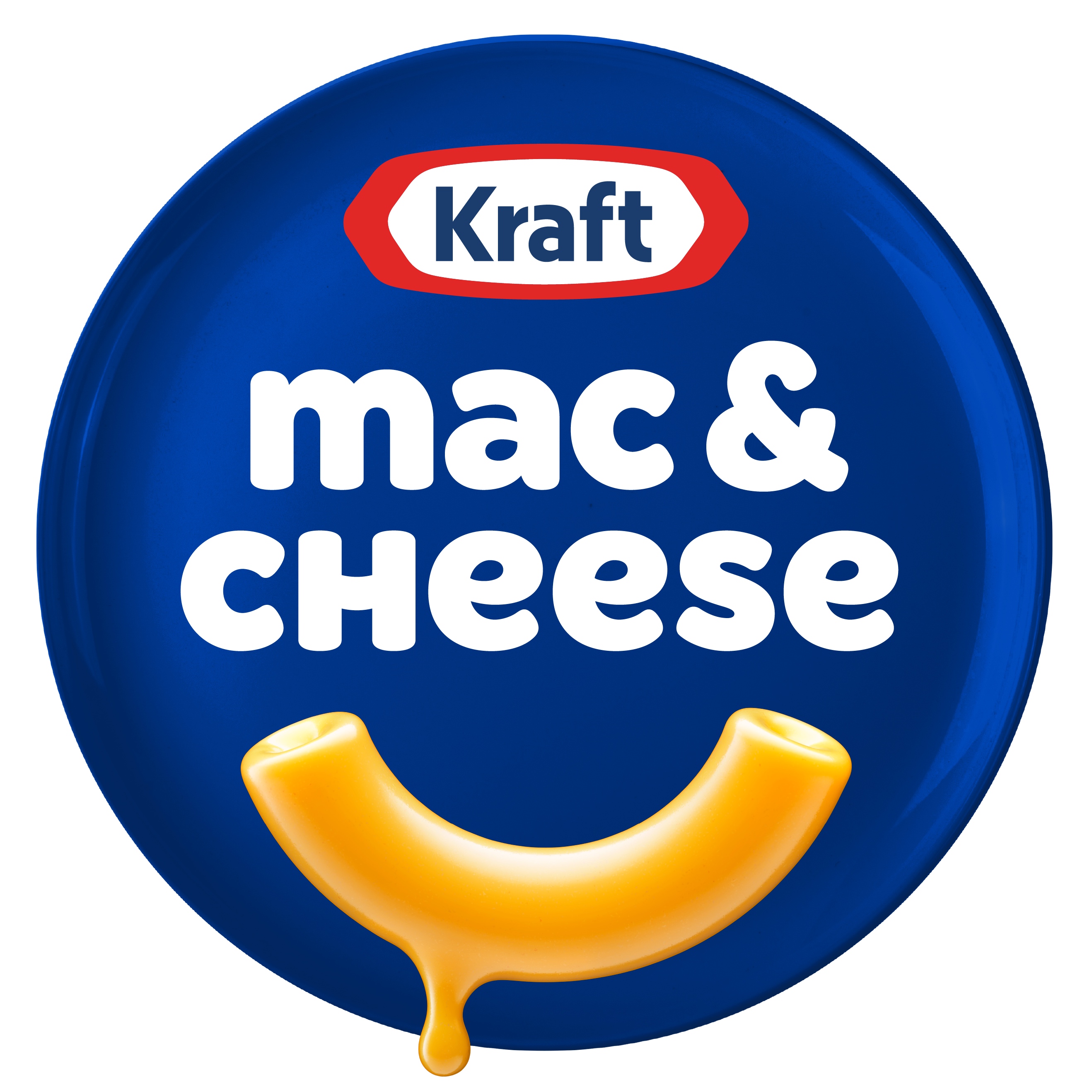
When Kraft announced the shift from "Kraft Macaroni & Cheese Dinner" to just "Kraft Mac & Cheese," the internet had thoughts. Some called it "minimalism gone wrong," while others didn't even notice until they were halfway through a bowl of neon-orange shells. But if you look closer at the design choices made by the creative agency JKR (Jones Knowles Ritchie), there’s a lot of psychological heavy lifting happening in that blue and yellow curve.
The Smile You Can't Unsee
The most obvious change in the current Kraft Mac and Cheese logo is the "noodle smile." If you look at the negative space under the word "mac," there’s a distinct, dripping, golden-orange curve. It’s meant to look like a single noodle coated in cheese sauce. But more importantly, it’s a smile.
Brands love smiles. Amazon has one. IHOP has one. Tostitos has two people sharing a chip that looks like a smile. It’s a cheap psychological trick, but it works because it triggers a sense of comfort. Kraft needed that because, let’s be real, the "blue box" isn't exactly a health food. It’s "comfort food." By leaning into the smile, they moved the brand away from being a "grocery item" and toward being an "emotional experience."
The typography also got a massive overhaul. Gone are the sharp edges and the stiff, formal block lettering. The new font is rounded, soft, and thick. It looks like it was squeezed out of a tube of cheese. It’s "squishy." In design terms, we call this "appetite appeal." You want the font to look as delicious as the food inside. Or, at least, as delicious as 7-minute stovetop pasta can look.
Dropping the Word Dinner
Why lose the word "Dinner"?
That’s a big move for a brand that’s been around since 1937. For almost a century, it was Kraft Macaroni & Cheese Dinner. But language evolves. Nobody actually says, "Hey, do you want some Macaroni and Cheese Dinner?" They say, "I’m making mac and cheese."
By dropping the formal "Dinner" suffix, Kraft finally caught up to how people actually talk. It makes the brand feel less like a stuffy corporation and more like a friend. It also reflects a shift in when we eat it. It’s a snack. It’s a side dish. It’s a midnight "I just got home from the bar" meal. Limiting it to "dinner" was actually hurting their market reach.
The Evolution of the Blue Box
If we look back at the history of the Kraft Mac and Cheese logo, it’s always been about that specific shade of Royal Blue. It’s a power color. In the 1930s, when the product launched during the Great Depression, that blue box stood out as a premium-looking item that only cost 19 cents. It promised four servings in one box. It was a miracle product.
Through the 50s and 60s, the logo was pretty utilitarian. It was "Kraft" in that iconic red hex nut shape, with "Macaroni and Cheese" in a standard sans-serif. It wasn't trying to be cute. It was trying to be efficient.
Then came the "swash" era. You remember the one—the logo with the big, sweeping red and yellow curves that made the box look like it was moving at 100 miles per hour? That was the 90s and early 2000s aesthetic. Everything had to be "dynamic." It was the era of Xtreme sports and Go-Gurt. Kraft followed suit, making their logo look like a sports car brand.
But the 2022 redesign killed the speed. It slowed everything down.
The Color Palette Shift
One thing people miss when talking about the Kraft Mac and Cheese logo is the color saturation. If you put a box from 2010 next to a box from 2024, the blue is different. It’s deeper. It’s more matte.
The yellow-orange of the "smile" is also more specific now. It’s calibrated to match the actual color of the cheese sauce. This is a subtle way of promising consistency. When the logo color matches the food color, the brain builds a bridge of trust. You know exactly what shade of orange your tongue is about to turn.
Why the Internet Hates Change (And Why Kraft Didn't Care)
Whenever a major brand changes a logo, the "minimalism is ruining everything" crowd comes out in full force. We saw it with Airbnb, we saw it with Google, and we definitely saw it with the Kraft Mac and Cheese logo.
Critics argued that the new look was too "flat." They missed the gradients and the 3D effects. But here’s the thing: 3D logos look terrible on a smartphone screen.
In 2026, most of your interaction with a brand isn't just on a physical shelf. It’s on an Instacart thumbnail. It’s in a social media ad. It’s a tiny icon on a digital receipt. A flat, bold, simple logo like the new "noodle smile" scales perfectly. Whether it’s 20 feet tall on a billboard or 20 pixels wide on an iPhone, you know exactly what it is.
The "Cheesy" Competitive Landscape
Kraft isn't just fighting off generic store brands anymore. They’re fighting Annie’s Homegrown, Goodles, and various "premium" or "healthy" mac and cheese options that use white cheddar and organic semolina.
Those brands usually use a lot of white space and "earthy" tones. Kraft decided to go the opposite direction. Instead of trying to look "healthy," they doubled down on being the most "mac and cheese" mac and cheese. They embraced the artificiality of the blue box. They leaned into the nostalgia.
The logo says: "We aren't a salad. We are a bowl of warm, cheesy joy. Take it or leave it."
Key Elements of the Current Design
If you're looking at the logo right now, notice three specific things:
- The Font Weight: It’s heavy. It implies a "full" feeling.
- The "Smile" Curve: It’s asymmetrical. It looks organic, like real sauce dripping, not a perfect geometric circle.
- The Kerning: The letters are very close together. It feels "tucked in," which adds to that "comfort" vibe.
It's actually quite a sophisticated bit of graphic design for a product that costs less than a cup of coffee. It manages to be modern while still feeling like something your grandma would have had in her pantry. That’s a hard line to walk.
Actionable Insights for Brand Enthusiasts
If you’re a business owner or a designer looking at the Kraft Mac and Cheese logo for inspiration, there are a few real-world takeaways you can actually use.
First, simplify your name if your customers already have. If everyone calls your business a nickname, maybe that nickname is your new brand. Second, find your "smile." Is there a shape in your product that evokes a positive human emotion? Finally, own your identity. Kraft didn't try to look like an organic kale chip. They leaned into the blue and the orange because that’s where their equity lives.
When you’re refreshing a legacy brand, you don’t throw out the history; you just scrape off the crusty bits and give it a fresh coat of paint.
To really see the impact of this branding, next time you're in the pasta aisle, don't look for the words. Just look for the "smile." You'll notice it from twenty feet away, which is exactly what the designers intended. It's a masterclass in visual shorthand.